Monday, 26 March 2012

Question 1

In what ways does your media product use, develop or challenge forms and conventions of real media products?

Inspiration:


For the inspiration of our thriller movie we studied a variety of Alfred Hitchcock's thriller's and other thriller movie's which i then went onto analyze and talk about on my blog. By doing this it helped me get a look at ways in which other thriller's have been built up to use suspense and the way's in which they have made the viewer almost allow themselves to get involved and get into the movie to become one with the movie. This helped as i could then go onto use these technique's in our thriller movie. 


Here is a link to the advert for the film "No Country for Old Men" which i analyzed at the start of the course. This is one of the film's which helped me to understand the convention's on the way a thriller movie works:
http://www.youtube.com/watch?v=_kqoJevTIIQ&feature=player_embedded


This is one of the photo's which i captured from the above link to then go onto analyze:


Genre:


The genre of the movie is thriller. By using thriller as our genre it allowed us to not quite make a horror but show off different shot size's and technique's to add suspense to the movie. This was good as it allowed us to use a wide variety and it also allowed us to use different music/sound effect's in the background of the movie which can be seen as very good media techniques.
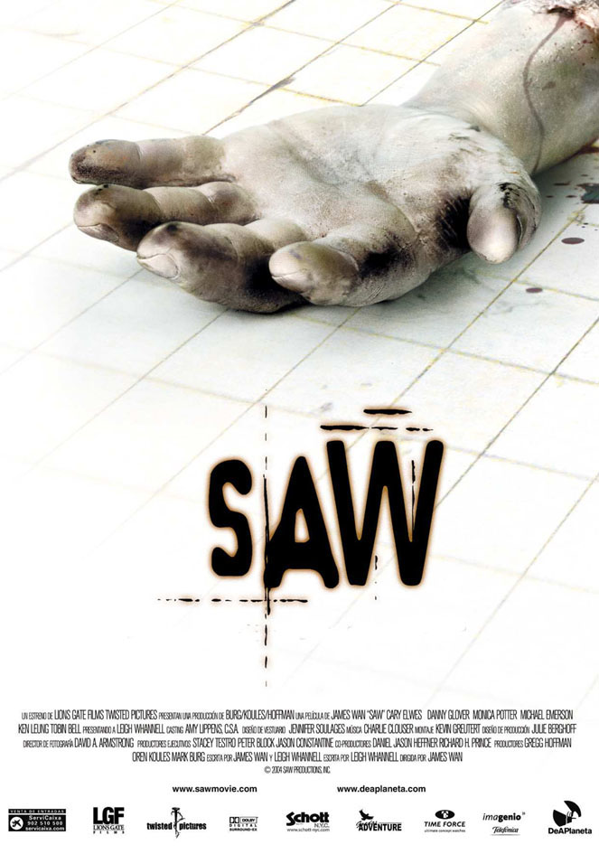

Font:


To come to a final decision on the font we used for out main title in the thriller movie i looked/analyzed a variety of other thriller and even horror movie's to get an idea of what sort's of font's looked good for this type of film. It looked over a variety of font's which came across as spooky or edgy which show's off how other film maker's thought.


Here is a link to the part of my blogger where i analyzed the fonts:
http://elizabethrosedaviesasmedia.blogspot.co.uk/2012/02/fonts-for-thrillers.html


This is one of the cover's to a film which i analyzed the font on it. I did this with numerous different film covers to help come to a decision of what out thriller font should be:


Production Logo:


The production logo which we used in the end was created and based on a saying which we thought fitted in with the thriller scene. By doing this it also show's off what sort of movie's we would be making just by looking at our logo. We decided to make the main title of our logo in a different language as we felt it made it fit even more into this.


Here is an image of our final logo:

Final Film


Friday, 3 February 2012

Fonts for thrillers

All these are different fonts for the title's of thriller movies. By looking up these it helped me to decide on what sort of font i should go with for my own thriller movie.


For the title of this thriller they've given it the effect of blood, they've done this by making it red and as it is a shakey type of text. This goes with the image in the background and tells you straight away that it is going to be gory in some way.


The font of the title for this thriller looks as if it's been written in fire, giving it an edgy approach to look at when seeing it.


For the font of this thriller title it is quite plain and there isn't much to it, but they've decided to make the word "lost" in bold to give it enthuses and show off that it is an important word.


The font for this thriller title looks like its been typed up on a old computer giving this movie an authentic look, making it look old fashioned.


The font of this thriller it quite chunky and just blocked. Making it look scary as it's very in your face, alongside with the coloured theme orange.


The font on this thriller is made to look like stitching, which goes with the image in the background. This gives off a scary effect, letting the viewer knowing from just look at it that it's going to be a thriller.


The font for this thriller is more blocky than the other's making it look quite stern, and giving off the impression that it's not going to be easy whatever happens. This gives off an image to the viewer that this thriller will not mess around.


The font for this thriller title has the effect that it has physically been written down on a piece of paper, but made to look scruffy. This gives off a frightening image from the first look you take at the movie cover.


The font for this thriller title looks as if it's been cut off, they letters all have sharp corner and sides, allowing it to go with the image behind it of a knife.


Both of the above thriller titles use the same font for every film they have released of the "Saw" collection. By doing this it makes the movie well noticed as people will recognize it. The font itself gives off a smudged printed look making it seem quite scary.


The font for the title of this thriller is very straight forward, there's nothing very complicated to it. It's been all written in high case though which makes it stand out more than what it would if it wasn't.

Wednesday, 1 February 2012

Creating Animatic out of Story Boards


I clicked on the rectangle marquee tool, and then went on to draw around the storyboard image i wanted. I then went onto copy the selection, to do this i clicked CMD+C.


To create a new canvas i then went onto click Cmd+N.


I then pasted the slection onto the new canvas, to do this i pressed Cmd+V.


After that i saved the image as a .jpeg onto the desktop.


I then wanted to make the image quality as good as possible, so to do this i changed the jpeg render options. I then went on to repeat this for the rest of the storyboard images.

Friday, 20 January 2012

Risk Assessments


This is the group's risk assessment sheet's. We chose the different option's which best fitted the thriller we were going to go onto film and have been filming. This means that everything we do/have done for this movie are all safe and have been checked through beforehand.

Wednesday, 4 January 2012

Continuity Exercise


This is our continuity exercise. In this we took our original filming of our "tester" movie and then went onto edit it. This allowed us to get used to using the different editing programs and find out which ones best suited us as a person to use. In this i put cross over changes so that it could go from one scene to another, yet do this in a smooth manor. 

Anamatic


This is the final product which came out as the Anamatic.