All these are different fonts for the title's of thriller movies. By looking up these it helped me to decide on what sort of font i should go with for my own thriller movie.

For the title of this thriller they've given it the effect of blood, they've done this by making it red and as it is a shakey type of text. This goes with the image in the background and tells you straight away that it is going to be gory in some way.

The font of the title for this thriller looks as if it's been written in fire, giving it an edgy approach to look at when seeing it.

For the font of this thriller title it is quite plain and there isn't much to it, but they've decided to make the word "lost" in bold to give it enthuses and show off that it is an important word.

The font for this thriller title looks like its been typed up on a old computer giving this movie an authentic look, making it look old fashioned.

The font of this thriller it quite chunky and just blocked. Making it look scary as it's very in your face, alongside with the coloured theme orange.

The font on this thriller is made to look like stitching, which goes with the image in the background. This gives off a scary effect, letting the viewer knowing from just look at it that it's going to be a thriller.

The font for this thriller is more blocky than the other's making it look quite stern, and giving off the impression that it's not going to be easy whatever happens. This gives off an image to the viewer that this thriller will not mess around.

The font for this thriller title has the effect that it has physically been written down on a piece of paper, but made to look scruffy. This gives off a frightening image from the first look you take at the movie cover.

The font for this thriller title looks as if it's been cut off, they letters all have sharp corner and sides, allowing it to go with the image behind it of a knife.
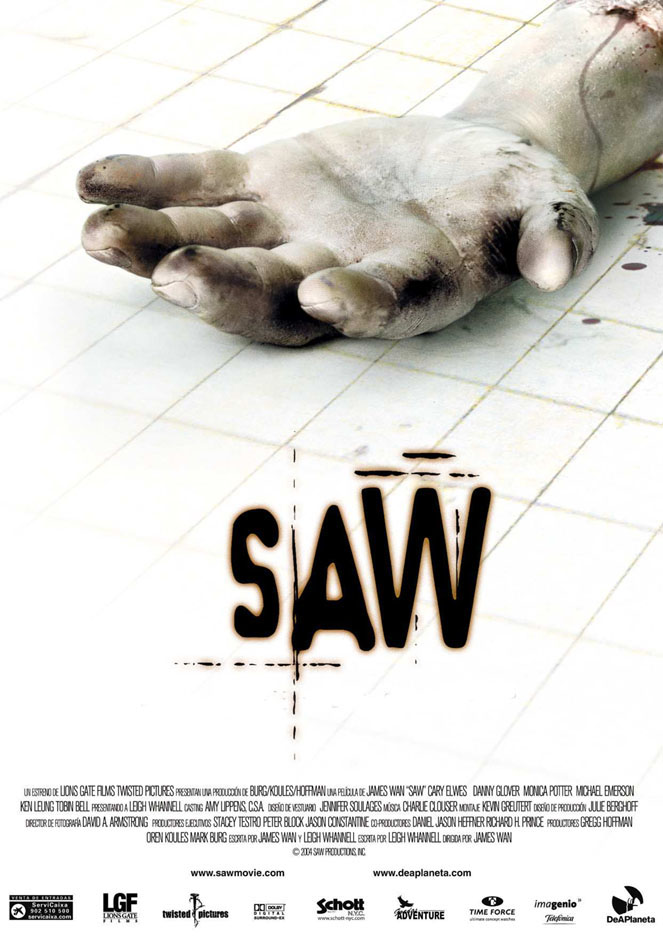

Both of the above thriller titles use the same font for every film they have released of the "Saw" collection. By doing this it makes the movie well noticed as people will recognize it. The font itself gives off a smudged printed look making it seem quite scary.

The font for the title of this thriller is very straight forward, there's nothing very complicated to it. It's been all written in high case though which makes it stand out more than what it would if it wasn't.
No comments:
Post a Comment